Co-Designing Pin
Students know campus support exists. They just don’t believe telling anyone will change anything. I built a participatory process around that distrust. A pop-up campaign mapped the needs students absorb without reporting, and two co-design workshops I facilitated turned those findings into Pin, a peer-led concept for a campus support map. An ethical assessment then stress-tested it against the people it could fail.
The Problem
The project started from a question: how can digital platform design enhance dignity and comfort in everyday life, in the small moments that public and digital environments routinely overlook? On a university campus those moments are concrete: a broken lift, an unaffordable lunch, a socket that doesn’t work, support services no one experiences as connected. The problem statement the research settled on: students experience everyday campus needs that are small and shared, and hard to resolve alone. Support exists; students just don’t experience it as visible, accessible or connected.
Research
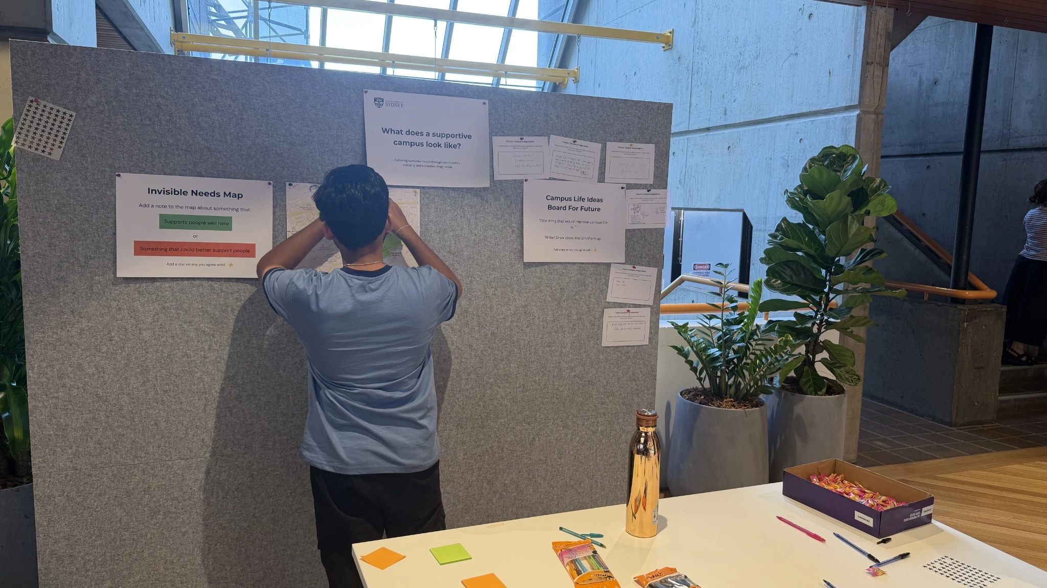
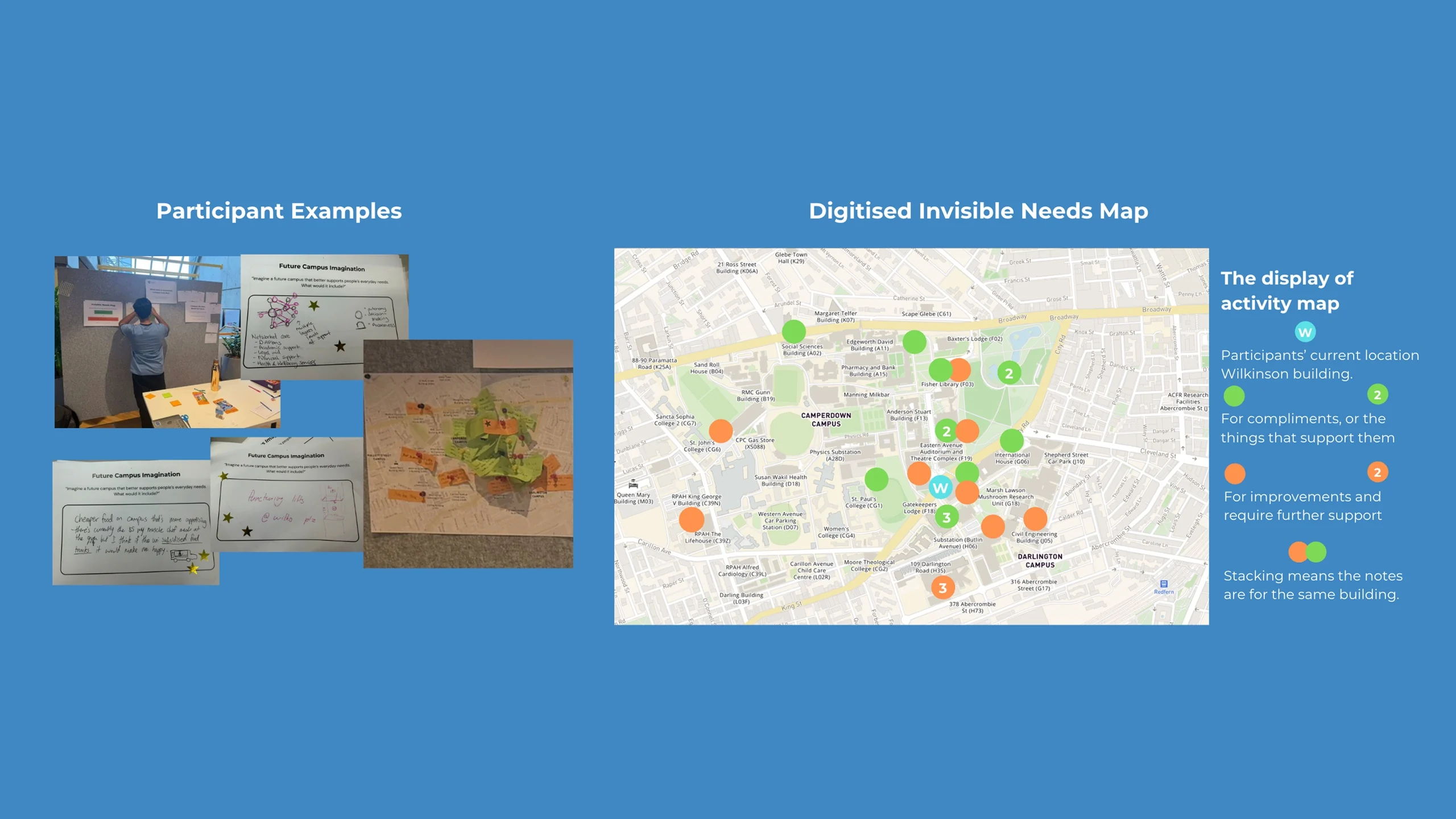
Research opened with a pop-up engagement campaign on campus, run as two public-facing activities. On the Invisible Needs Map, students pinned needs to the places they happen. Future Campus Imagination cards used gold-star voting so passers-by could weigh in inside a minute. I designed both activities to cast a wide net on what students notice, and where.
Supported by people, let down by place
What supports students is human: warmth, community, belonging. What fails them is physical: seating, food cost, broken lifts.
Services exist, the system doesn’t
The wellbeing, career and learning hubs were each praised individually; no one described them as connected.
Small needs, shared by many
Working lifts, affordable food, sheltered seating, all absorbed daily rather than escalated. Voting confirmed them as collective priorities.
The pop-up mapped categories and locations. What it could not show was how a need is noticed, tried, avoided and absorbed. That question needed a different method, and a different assessment.
Co-Design I: Campus Support Relay
The first of two generative workshops. It was separate from the pop-up in method, materials and purpose. Campus Support Relay ran for 60 minutes with four students, designed activity by activity to follow the path the pop-up couldn’t reach. Every material choice was deliberate: activities were pilot-tested first, the session ran under a consent-and-care protocol with opt-outs and no-face photography, and all materials were printed at 14pt+ in plain English.
The relay sheets surfaced what the campus never hears. Students bring power banks and share sockets, pay $40 for an adapter the campus should have made unnecessary, leave class to find a bin, restructure timetables to avoid a building. Transcripts, sheets and wall notes went through thematic analysis, which produced four insights that everything downstream follows from.
The campus creates invisible labour
When infrastructure fails, students absorb it through time, money and workarounds. None of it surfaces as a complaint, report or data point.
Trust is the barrier, not awareness
Students know the student centre exists. They avoid it because prior experience and peer reputation made it feel not worth the risk of rudeness or wasted effort.
Peers are already the support system
The most reliably cited support was other students: crowdsourcing parking, clean toilets, lockers. A shadow system already runs parallel to the official one.
Dignity erodes through accumulated small costs
No single failure is catastrophic, but $40 here and a four-minute detour there compound into feeling like, in one participant’s words, a “cash cow.”
Two journeys for the same campus need. The journey the research found: noticed, tried, avoided, absorbed, ending as invisible labour with no report and no data point. The journey Pin designs: noticed, pinned anonymously, on the map, tracked publicly.
Students know support exists. They just don’t believe anything will come of telling someone.
Ideation: Co-Design II
The second workshop, a week later, turned the relay evidence into a design. It was built to be assumption-free. Insight cards were framed as evidence from the previous workshop, with explicit space to add, edit or challenge. Journey boards shipped blank with renameable stages, and no feature list was placed on the table. Seven activities carried the participants from handoff to a finished decision.
The board below is where the workshop left the concept.
| Must have | Test next / still uncertain | Avoid |
|---|---|---|
|
|
|
Key Features
Pin is a campus map where a student drops a pin on something broken or missing, +1s pins they share, reads short peer tips, and sees what the university actually did about it. Five screens carry the concept, and each one is a direct translation of a participant’s paper sketch and final star. The interface follows USyd’s design language, its ochre red, flat surfaces and plain typography, so Pin reads as campus infrastructure rather than a third-party app.
Map / Home: see the campus from a student’s eyes
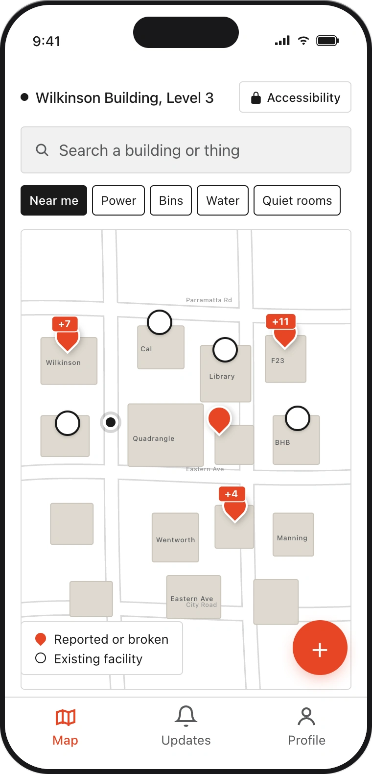
The map is the campus as students experience it. Red pins mark what’s broken or missing, each carrying a count of how many people it affects; hollow markers show the facilities that already exist and work. One glance answers whether your problem is already known, and how much weight is behind it.
Drop a pin: thirty seconds, everything optional
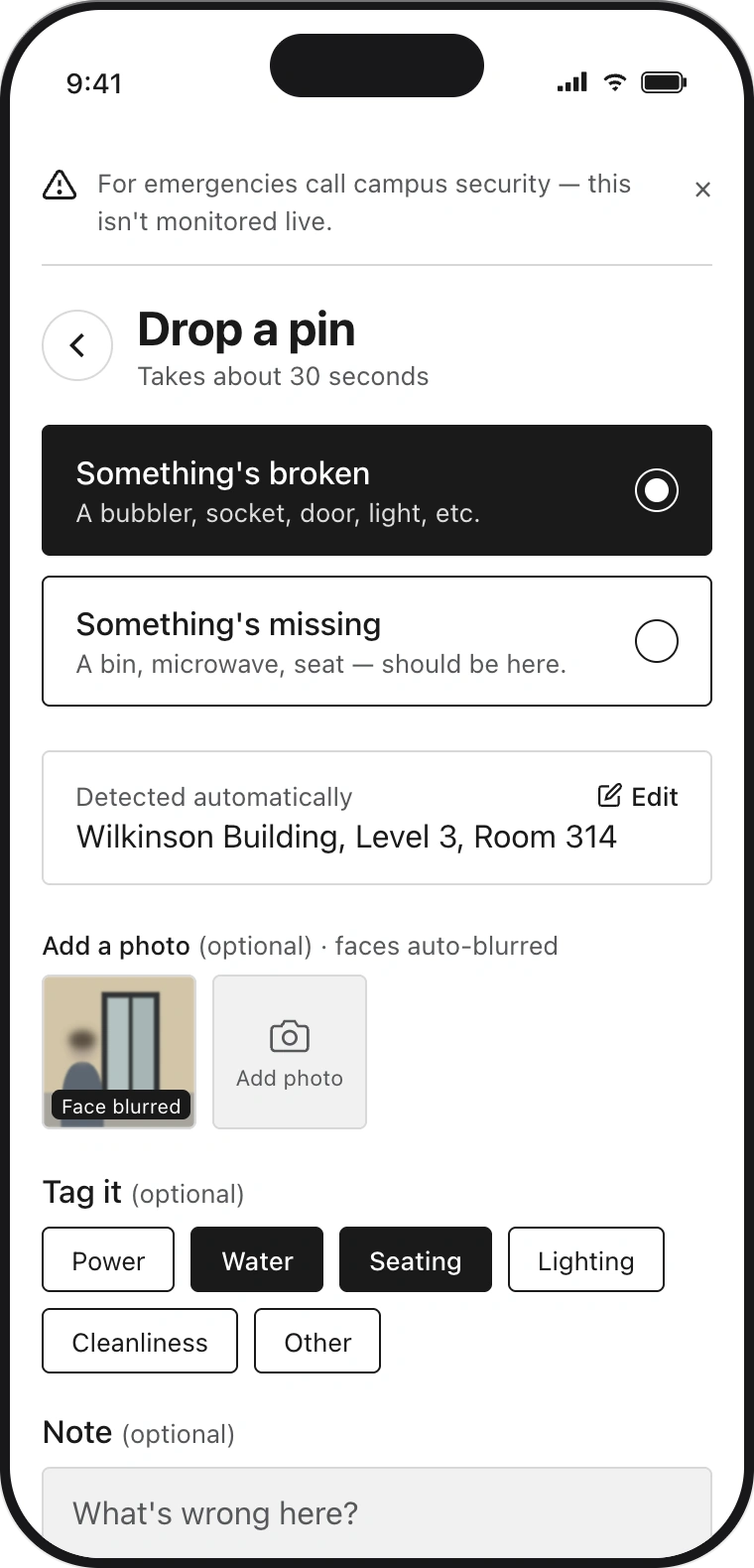
Reporting is built to cost nothing. The whole flow takes about thirty seconds, the location is detected automatically, and everything beyond the problem itself is optional. Faces in photos are auto-blurred, and urgent issues are redirected to campus security up front because Pin isn’t monitored in real time. The pace came straight from a participant’s final star: “if this isn’t fast, nothing else matters.”
Pin detail: who else cares, and what others did
A pin turns one person’s frustration into collective evidence. The +1 count shows how many people share the problem without naming any of them, and peer tips pass on what others actually did in the meantime. Those tips follow the workshop’s free-fallback rule: any tip that costs money must come with a free alternative. That rule came from the workshop’s finding that peer help can quietly recreate the cost barriers it is meant to remove.
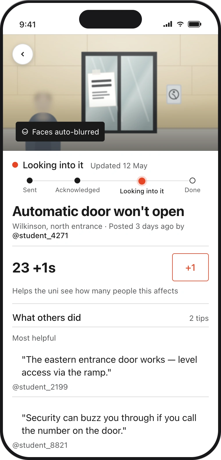
What the uni did about it: silence is the worst answer
Every report earns a public record of what happened next, from Sent through to Done, or an honest “Won’t fix, here’s why”. Every stage carries a date, and every outcome is explained in a plain sentence (“replaced, confirmed by site visit”). This feed exists because silence was the thing participants trusted least; as the parking scenario put it, “I’d take that over silence.”
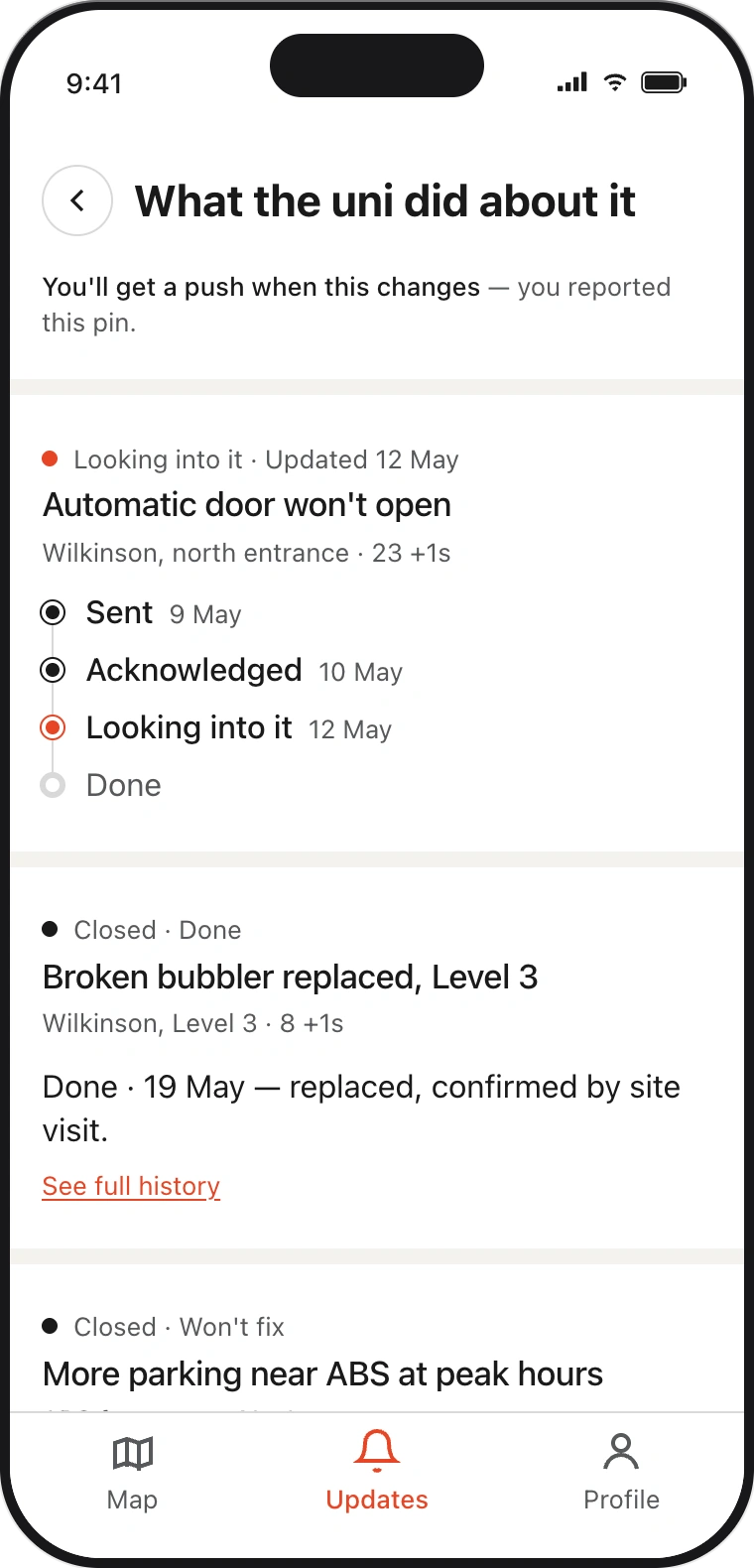
Accessibility request: same app, private track
Personal access needs never touch the public map. They travel a private channel straight to Disability Inclusion, with a faster acknowledgement target and control over how, or whether, the university replies. This split came from a participant-written stress test, and it carries the most ethical weight in the design, which is why the assessment returns to it.
Testing: An Ethical Assessment
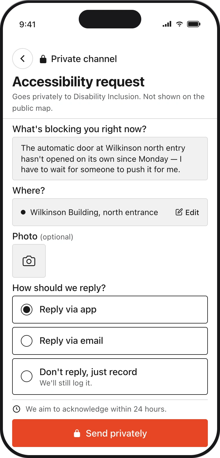
Usability-testing a paper prototype would have told me little, so the final assessment stress-tested the concept ethically instead. I built a composite persona I labelled P03: an undergraduate who has spent a week manually pushing a broken automatic door at Wilkinson north. Then I walked them through the journey Pin’s five features produce, using a standard journey-mapping format with one added row it doesn’t usually have: ethical pressure. Five points surfaced where the design starts to push back against the people it is meant to help.
Opens Pin after a peer mentions it; finds an existing pin on the same door.
“I have been pushing this door for a week.”
Considers stacking on the mis-tagged pin, then drops a new one with a short note.
“The pin says Power. Mine is access. Will I get heard?”
Pin routed to a named office; notification confirms it was received.
“At least it has gone somewhere named.”
Day 2: assigned. Day 5: in progress. Day 9: won’t fix this term, with a stated reason.
“Won’t fix is honest. It still leaves me at the wrong door.”
Reads the peer-confirmed fallback: the south entrance, four minutes further.
“A four-minute detour every day for the term is its own cost.”
Two speculation prompts from the Tarot Cards of Tech sharpened the critique. The Forgotten pushed on the schema: Pin’s tidy categories decide what counts as a reportable problem before a student has even opened the app, screening out anyone who doesn’t already speak the institution’s vocabulary. The Backstabber pushed on Status: the same public timeline that earns trust can also spend it. Aggregated across campus, it pressures the under-resourced teams doing the triage rather than the decision-makers holding the budget. And at a societal level, treating “won’t fix” as a clean closure teaches future public servants to log refusal as resolution, which is the failure mode the Robodebt royal commission documented.
Iterations
The redesign answers the three pressures that were actionable at screen level (E2, E3 and E4), and each change is traceable to the tension that caused it. E1 and E5 are structural rather than interface problems, so the reflection deals with them instead. All three screens are rebuilt inside the same USyd design language as the originals. The university’s ochre red is reserved for the primary action and the live status, and everything else sits on flat white surfaces with plain black type. Components like chips, radio cards and dated timelines are reused rather than redrawn. The redesigns had to read as the same product a student already trusts, not a designer’s fork of it.
E2 → The student writes first, the schema waits
The redesigned report screen opens with a plain text box, “say it however you’d say it”, and only then offers tags as suggestions to accept. Students describe the problem in their own words instead of translating it into the institution’s categories, and those words stay in the record beside whatever tag is applied.
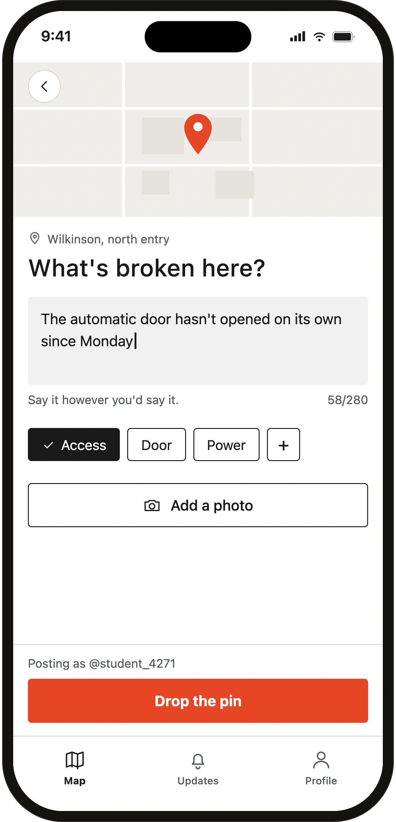
Drag to compare the original Drop screen with the free-text-first redesign.
Before-and-after comparison: the original Drop screen leads with category chips, while the redesign puts a free-text field first and offers the tags underneath as suggestions.
E3 → Peer weight without peer exposure
The private report now shows the reporter they aren’t alone: “4 others hit this the same day”, with nobody’s identity shared in either direction. Disability Inclusion sees the aggregate weight of a barrier while every individual stays invisible, restoring the peer confirmation that strict privacy had cut away.
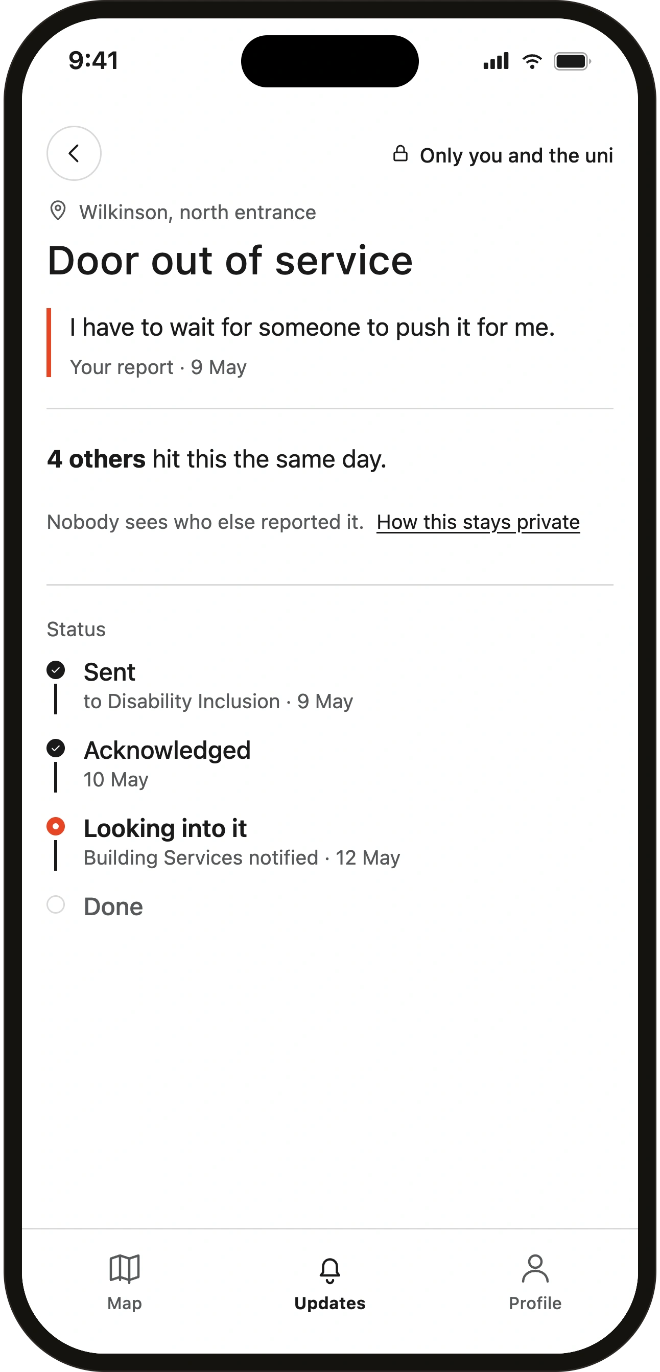
Drag to compare the original Pin detail with the private co-sign redesign.
Before-and-after comparison: the original private report beside the redesign, which adds a “4 others hit this the same day” count while keeping every reporter anonymous to each other.
E4 → “Won’t fix” stops being the end of the line
A report that can’t be actioned becomes Deferred instead of quietly closed. The screen commits to a review date with a reminder, states the real constraint holding the fix back, and names the person who signed the decision. Responsibility sits with whoever holds the budget, not the team that triaged the pin. Deferred reports reopen automatically; refusal becomes a tracked category, not a way to make a pin disappear.
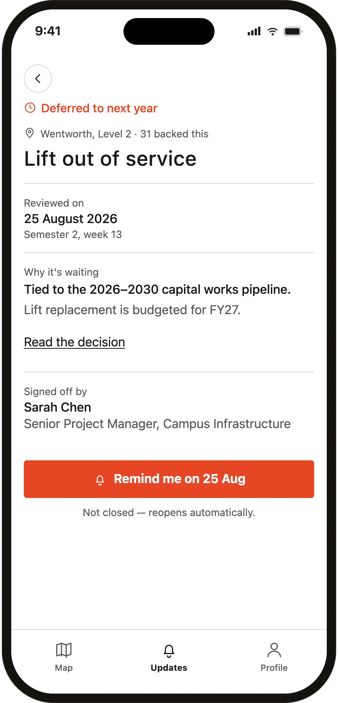
Drag to compare the original status screen with the Deferred redesign.
Before-and-after comparison: the original “Won’t fix” closure beside the redesign, where the report becomes “Deferred” with a review date, the blocking constraint, and the named decision-maker who owns it.
Reflection & Positionality
The biggest thing this project taught me was to design against my own conclusions. My instinct was to prove Pin worked; the ethical assessment forced me to map who it would fail instead, and that produced better decisions than any usability test would have. It also exposed a limit I’d built in without noticing. I am a white, male, able-bodied domestic student, and my four workshop participants were close to me in most of those ways. The people this problem most concerns (women weighing up safety, disabled students, international students with limited English, commuters and casual workers) were not in the room. The findings carry that limit.
I’m not claiming more than four people like me can show. The redesigns are deliberately small, because that’s as far as the evidence goes. The real next step isn’t more design from me. It’s putting Pin in front of the students it’s meant to help and letting them tell me where it falls down.