Echo
Nightlife wellbeing system built around a private in-venue reflection booth. Designed so young adults can accept harm-reduction support without fear of judgement, escalation, or staff involvement.
The Problem
Australians aged 18–24 are heavy users of nightlife, and formal support in that setting is associated with authority, escalation, and punishment. In a survey of 30 young adults, most turned to friends rather than venue staff or services when something went wrong.
The most commonly encountered services (chill-out spaces at 63%, free water at 60%, on-site first aid at 53%) all require approaching someone visible. For people who fear being identified, judged, or removed, that threshold is often enough to stop them asking altogether.
How might a design solution let young people maintain freedom and peer connection in nightlife while accessing harm-reduction support that feels safe, supportive, and non-punitive?
How I Understood the Problem
I triangulated across three research methods, following Flick’s (2018) triangulation framework.
Surveys (n=30)
18–24-year-olds. Quantified nightlife frequency, negative experiences, harm-reduction encounters, and help-seeking behaviour.
Interviews (n=12)
Intergenerational (n=4, ages 25–60) and target demographic (n=8, 18–24). 125 key quotes distilled into 49 statement cards and 13 insights.
Online Ethnography
One week of shadow observation across Reddit nightlife communities. Tracked how care, harm, and help-seeking narratives surface in digital spaces.
Research Insights
Three of the thirteen shaped every decision that followed.
Trust lives in friendships, not institutions. Peers are trusted over venue staff and security. But when incidents escalate beyond what friends can manage, there is no trusted middle ground. The gap between informal peer care and formal intervention is where people most need support, and least feel able to ask for it.
Fear of punishment deters help-seeking. Being kicked out, reported, or publicly identified stops people from reaching out, even when they recognise they need help. This applied equally to drug and alcohol situations.
Proactive interventions are under-adopted. Services like pill testing and chill-out zones exist and are widely encountered, but they are used reactively, after something has already gone wrong, rather than before.
The Response
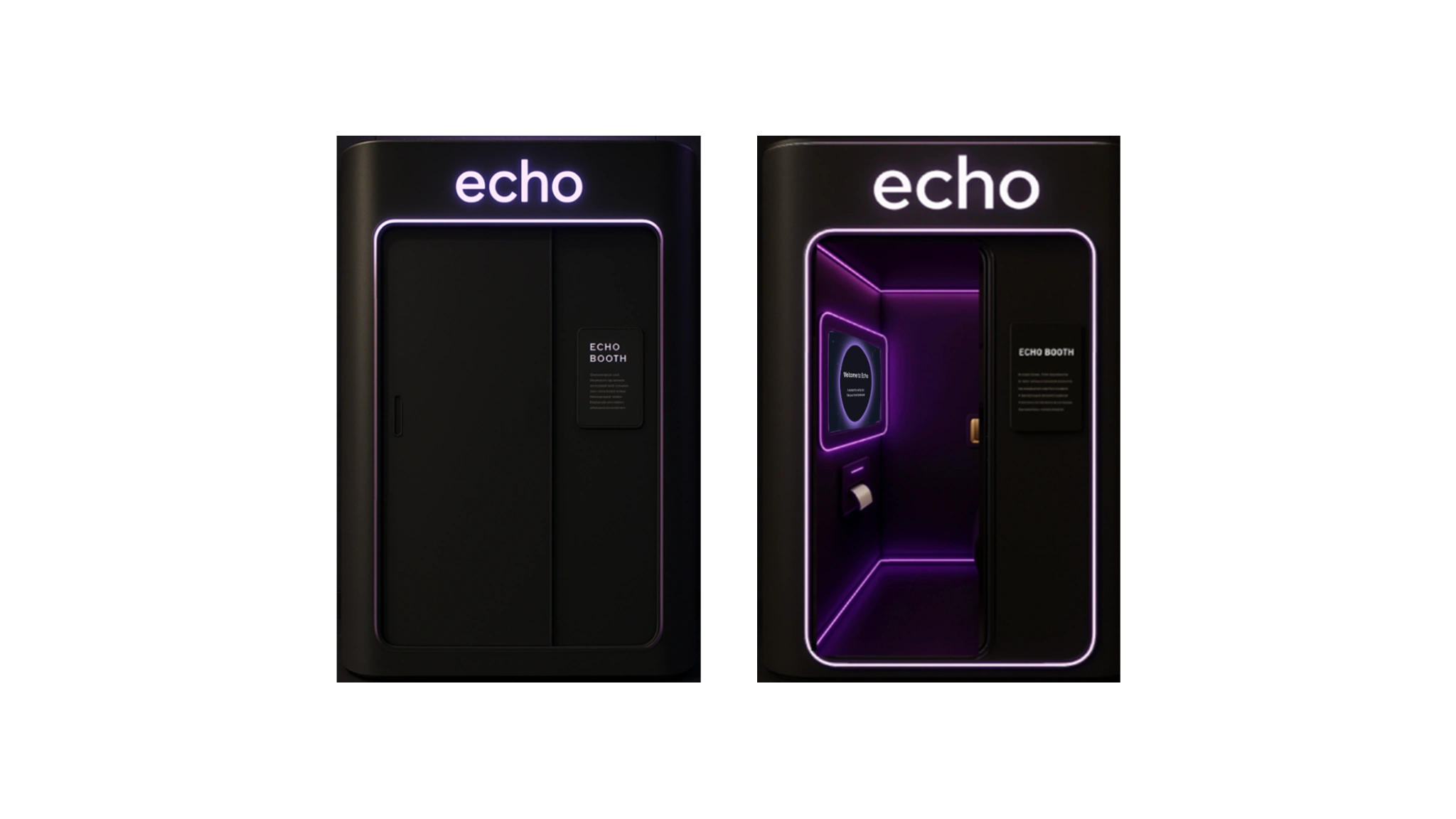
Echo is a single-occupant, acoustically buffered booth (1000×1000×2200mm) installed in nightlife venues. It gives people a private space to pause, reflect on how they’re feeling through guided prompts, and request non-punitive support from trained harm-reduction staff, not security. The interaction produces a personalised printed artefact they take home. The whole experience is voluntary and anonymous, and feels ambient rather than clinical.
The booth is the front end of a broader system. Sessions contribute anonymised, aggregated data that shows venues where and when distress clusters in their spaces. The longer-term logic: a venue that can see those patterns loses the excuse not to act on them.
Key Features
Tactile Rotary Rocker + Help Button
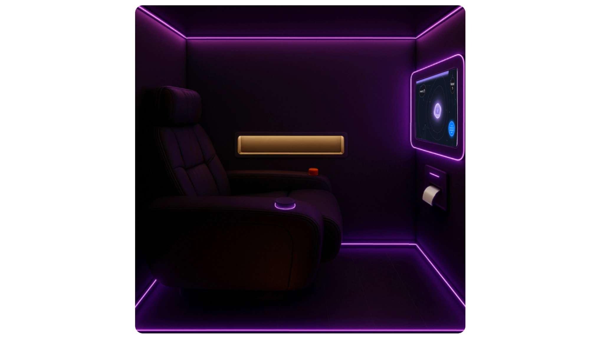
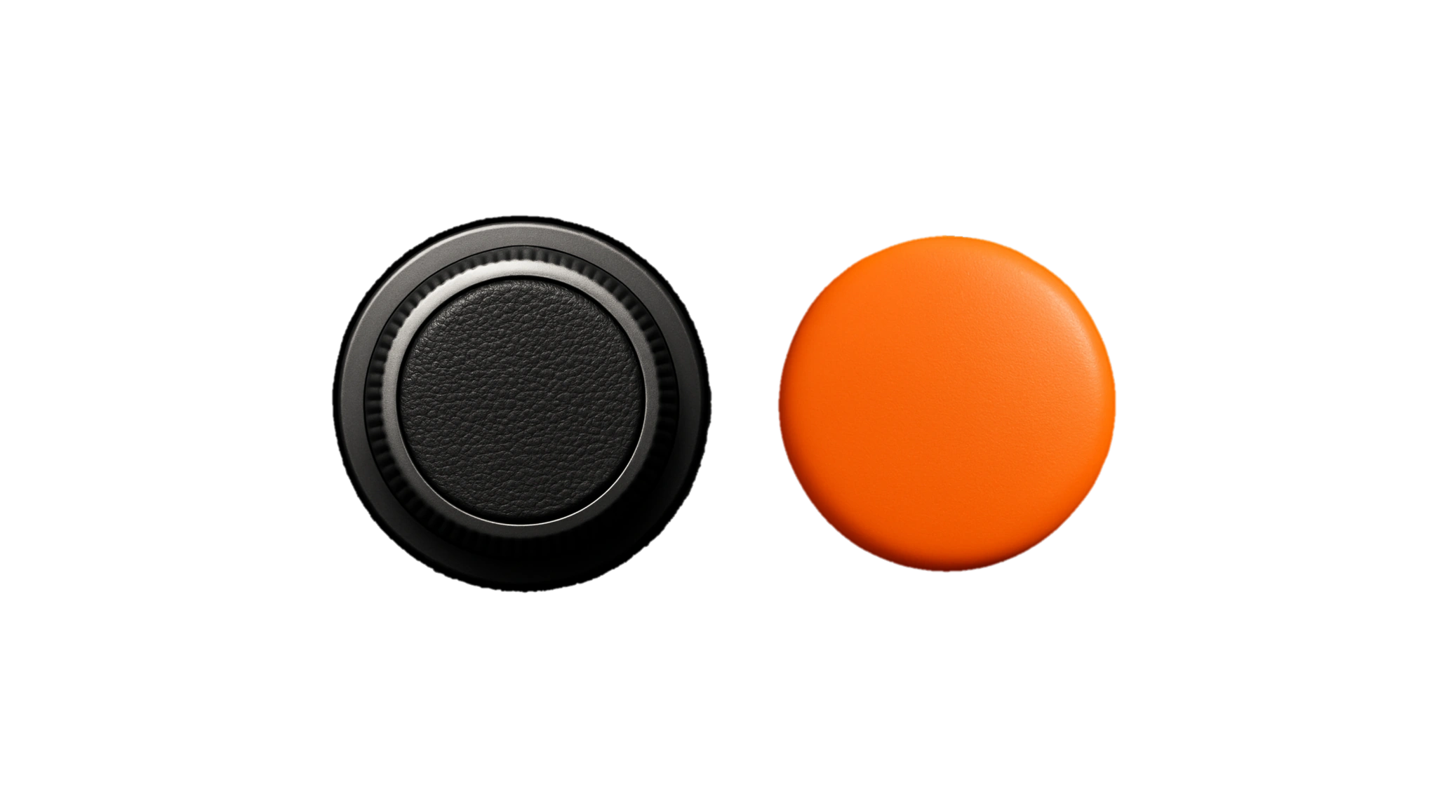
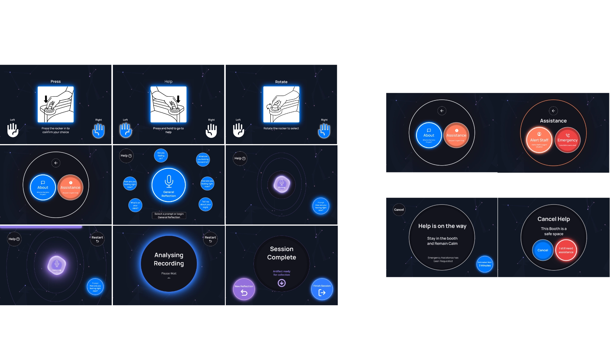
Instead of a touchscreen, Echo uses a physical dial and a dedicated help button. The dial has textured rubber and click-stop detents so users can find their way by feel alone. That matters when someone is impaired, anxious, or in low light. The help button requires a deliberate press-and-hold to activate, preventing the accidental emergency triggers the heuristic evaluation flagged as the most serious risk.
Guided Self-Reflection
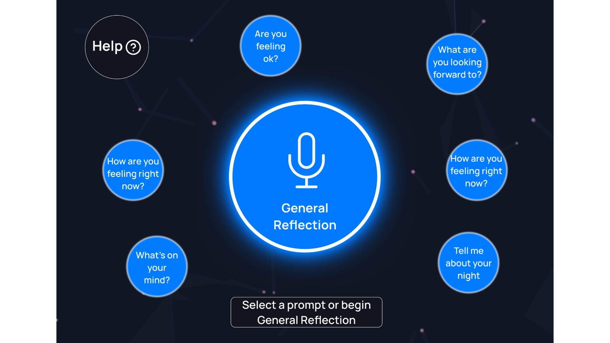
Users choose from six curated prompts or a general reflection option, then speak their response aloud. The interface listens and responds visually to their voice in real time, so it feels like a conversation rather than data entry. This came straight out of the interviews, which kept returning to the same want: to feel heard, not processed.
Printed Reflection Artefact
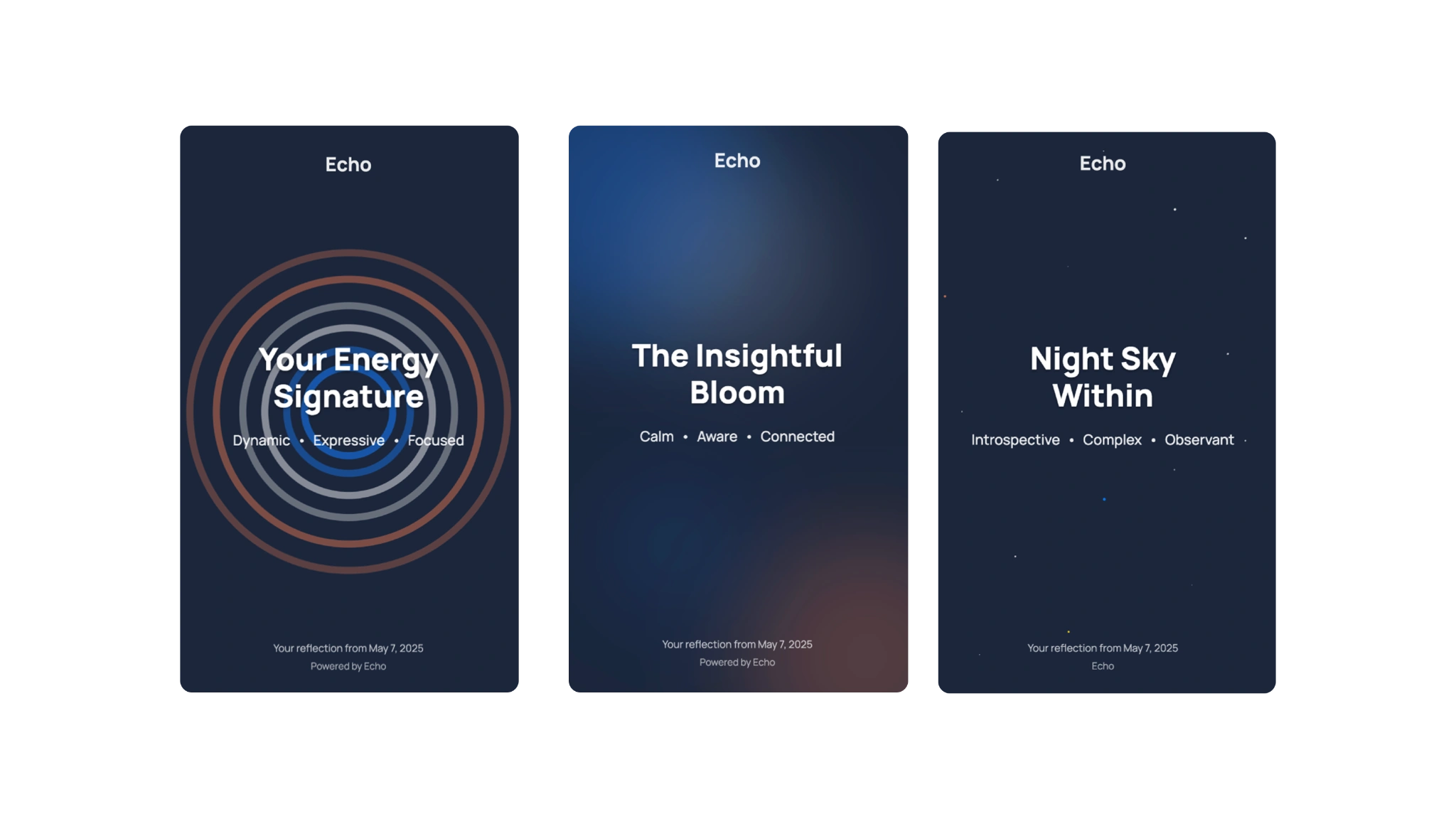
At the end of each session, the booth prints a personalised card that captures the emotional tone of the reflection. Users take it home as a tangible reminder of a moment of care. The printer sits inside the booth so no one outside can see what was produced, preserving the anonymity that makes the whole experience feel safe.
Design Process
Ideation
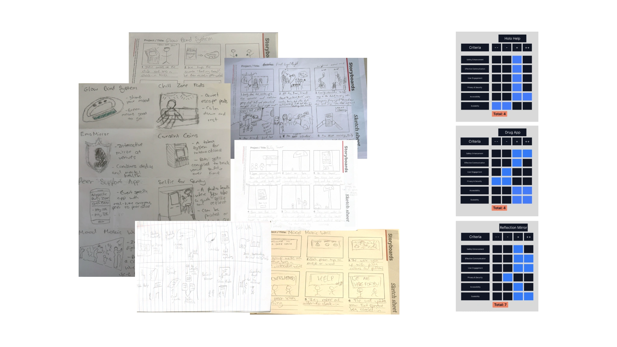
Concepts explored through Crazy 8s and storyboarding, then evaluated with a Harris Profile Matrix across safety enhancement, communication effectiveness, user engagement, privacy, accessibility, and scalability. The reflection booth scored highest on all six criteria.
Physical Prototyping
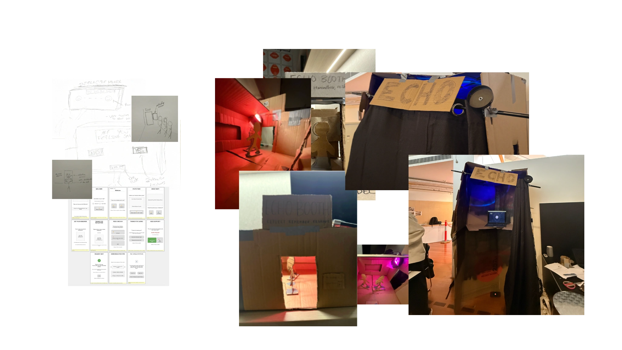
The first build was a four-person cardboard enclosure tested in a darkened room with ambient music and rotating colour-wash uplighting. It felt impersonal. The shared space worked against the intimacy the research demanded. The second iteration cut the booth from 2400mm to 1000mm, a single-occupant footprint, and replaced the fabric curtain with a flush sliding door, which gives better acoustic privacy and is easier to use when impaired. It also introduced an ergonomic armchair with an integrated pressure sensor that activates the interface when you sit down.
Heuristic Evaluation
Three evaluators assessed the mid-fidelity prototype against Nielsen’s 10 usability heuristics on a 0–4 severity scale. The process followed five steps: setup and brief, 5-minute review, 10-minute free exploration, 5-minute Q&A, and 15-minute form completion. Six problems emerged:
- System status unclear: “Waiting” and “Listening” were too visually similar; users couldn’t tell if the booth was recording
- Abstract language: “See your inner landscape” confused people; prompts needed to be literal
- Touchscreen mis-taps: impaired users struggled with screen input, confirming the need for physical controls
- No error recovery: no way to cancel, go back, or restart at any point
- Help path felt punitive: one-tap emergency dispatch made people afraid of accidental calls
- Low-light navigation: printer slot, booth edges, and controls were hard to find in the dark
“It feels like I’m talking to myself in the mirror, not filling out a form.”
19 Documented Iterations
I addressed every evaluation finding. The ten changes that mattered most:
16 points above average: Grade A on the Sauro-Lewis scale
Reflection
The research kept returning to one fact: young people weren’t avoiding help because it didn’t exist. They avoided it because asking felt like getting in trouble. Each decision that survived to the final prototype (the press-and-hold help button, the acoustic buffering, the printer moved inside the booth) exists to lower that one threshold.
The system layer is the part I can’t stand behind yet. Venue accountability from aggregated session data sounds good on a slide, but nothing in the booth testing proves it works. To take Echo further I’d have to sit down with the harm-reduction workers and venue operators who’d actually run it, and they’ll raise problems I can’t predict from here.